When I found out that they had a under-utilized website, I volunteered to redesign it. The first version of the website can be seen below.
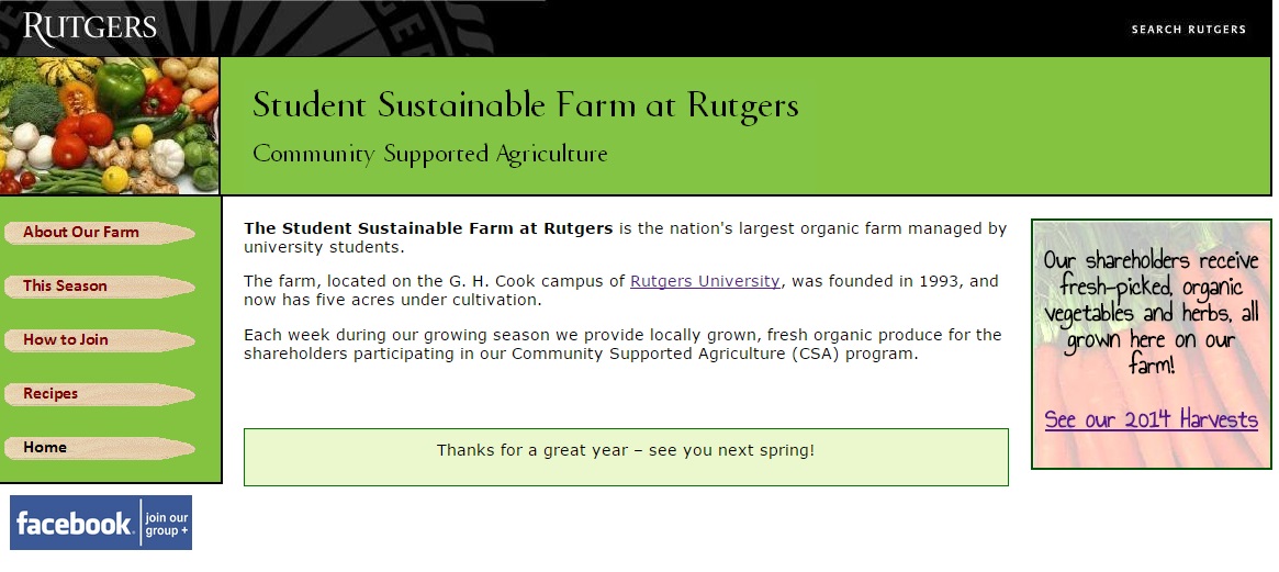
I gave it more of a "farmstand feel" by updating the palette of colors, adding a brightly colored picture of vegetables in the header and using garden stakes for the newly streamlined list of links on the left.
In 2009 I brought the website into compliance with Rutgers University web standards – they required each page to have the Rutgers logotype banner, search link, and a copyright notice.
Minor changes in 2010 included a change to the name of the farm, from the "Cook Student Organic Farm" to the "Student Sustainable Farm at Rutgers", along with adding a link to the farm's new Facebook group, which was created so the farmers and shareholders could communicate with each other.
Each week the harvest was listed on the front page, in a box with a
vegetable background, using a "chalkboard" style Google Font.
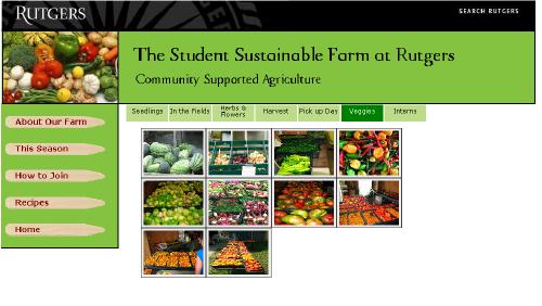
One page featured a CSS-based photo gallery, allowing the user to mouse over a set of thumbnails and view each photo. The photo gallery code was adapted from one at CSSPlay.
In the 2016 season, the university's Office of Agriculture and Urban Programs took over responsibility
for the farm's website.
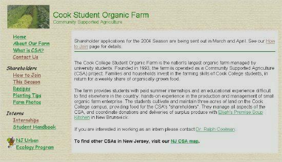
In this initial design, I reorganized the contents and placed the navigation links on the left, and added new sections for vegetable recipes and information about the current growing season.
I chose this background texture because of its resemblance to a plowed field, and branded each page with the farm's name and a picture of the crops.